top of page
On this page:
Exercise 1: 4pp A5 Zine
Exercise 2: Infograph
Exercise 3: Interactive Quiz
Exercise 4: Interactive Microsite
Exercise 5: Interactive Game
Exercise 1 :
4pp A5 Zine
4pp A5 Zine
I have never really used InDesign before but learning different techniques and tools from the Design Studio + Design & Making Class was an eye-opener for me! I created a "How I designed" zine from my branding assignment.
Cover Page
I decided to use the poster as the artwork and added the "HOW I DESIGNED" text to tell readers what this zine is about in a simple yet clear way.

Page 2 & 3
I started by introducing the font that I used for the brand. The Newake font has a thick, bold appearance, making it ideal for posters where attention needs to be captured quickly, much like retro sports posters. Newake's structured letterforms give off a modern but timeless feel that echoes the simplicity found in retro designs. The readability of Newake in both uppercase and lowercase makes it functional for headlines, taglines, and supporting text in your design.
The palette includes warm colors like burnt orange (#bf633d) and mustard yellow (#d6a854), which are reminiscent of vintage sportswear and posters from the '70s and '80s. These colours evoke nostalgia while maintaining a grounded, athletic vibe. The green (#7a8d64) and black (#281f1f) provide strong contrast and balance, further enhancing the sporty and bold elements of the design. The softer cream (#f1e5d4) ties it all together, offering a neutral background that allows the bolder colours to stand out. The combination of these colors creates a playful yet strong atmosphere, aligning with the keywords like fun, bold, courage, and sporty.


Page 4 & 5
I then introduced what the brand was about... as I am writing this I am just thinking why did I do that? Shouldn't the brand intro come first? Oops, I guess page 1 and page 4 need to do be swapped. I also introduced the brand logos. I did two versions of a logo offer flexibility for various contexts. The primary logo, featuring the dog illustration and text, is ideal for digital platforms or posters where there is ample space and the finer details can stand out. The circular emblem, on the other hand, is better suited for smaller spaces or branding on items like patches, merchandise, or icons, where a simpler, more compact design is needed.


Page 6 & 7
I then showed the graphics that was used for the poster which was an illustration of Rocco wearing RHF gear and snowboarding. The next page was the tag line. The mirrored text creates a strong visual impact, drawing attention to the key message. By flipping the text, I wanted readers to spend more time processing the graphic, emphasising the importance of the words. The mirrored text also symbolises reflection, metaphorically suggesting the idea that "faith" requires looking inward or considering an alternate perspective. The phrase "Faith It Till You Make It" suggests persistence and belief, and the mirror flip may reinforce this idea by visually repeating the message.


Back Cover
I completed the zine with a horizontal flip of the mountain to simply create a "back-view" of the mountain. This creates a cohesive visual narrative from front to back, offering a sense of completion or continuation. By showing snowboarder Rocco on the front and showing the "back of the mountain" on the reverse side, I represented the full experience of navigating a mountain as an adventurous and sporty snowboarder.
Exercise 2 :
Infograph
Infograph

I created the infograph using Illustrator as most of my CPJ stuff were already previously done using Illustrator. After attending several InDesign lessons, I wanted to incorporate some of the things that I have learnt, particularly concerning layout composition and achieving visual balance. I focused on structuring the content with clarity, ensuring that each section was well-spaced, and applying a hierarchy that guides the viewer’s eye naturally down the timeline.
Exercise 3 :
Interactive Game/ Quiz
Interactive Quiz

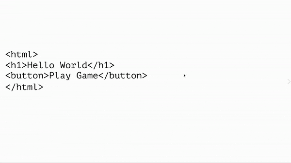
I was ambitious to launch an icecream shop but I ended up with 16 pages on InDesign. I drew the elements on Illustrator and created 9 different icecream combinations.


I learnt how to add hover animation to my elements, I decided to keep it simple by turning the vectors to be filled white upon hover and also linking to the respective pages upon clicking the buttons.


The hardest part was creating a page for every combination (could have been worse if I did more toppings) but how can I not give this little birb icecream?
Penguin 1 - 0 Ray

Exercise 4 :
Interactive Minisite
Interactive Minisite
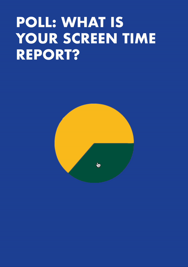
I already had these pages done from my CPJ done in illustrator so I thought it would be interested to animate them such that it was a unique way to present my data.
For the pie charts, I was reminded of buttons so I made them clickable so that it reveals the relevant data. As for the second page, I thought why not made the percentages clickable instead to try something different which I did and it was an interactive page where when you click the different percentages, it reveals the tops methods of practicing digital minimalism based on a survey by ExpressVPN. I had to carefully manage layers and visibility, testing each interaction to ensure everything functioned as intended. The iterative testing was crucial as I might have overlooked some animations and the buttons do not work as intended.
Exercise 5 :
Interactive Game
Interactive Game
Game Scenario 1
Game Scenario 2
One of the most enjoyable aspects was brainstorming different scenarios that users might encounter and planning the interactions accordingly. I used cat memes because I needed cat therapy, purrfect solution to every problem. It was a challenge to make sure that every scenario was accounted for and each button functioned as intended.
However, during review, I realised that I had initially missed out a scenario. This mistake underscored the importance of detailed user flow planning and thorough testing. It served as a learning moment for me, emphasising the necessity of considering every possible interaction from the player's perspective. It’s a reminder that the little things are not just small and they are what holds the "system" together.
bottom of page